Written for my Contemporary Design Issues Class in 2021. Assignment response to the question “What are the key elements of a successful city brand identities?
Cities are a representation of a country’s culture, values, and ideals. Therefore, it is important for the city to have an identity that is distinct from other cities to compete on the global stage. Elizabeth Glickfeld in ‘On Logophobia’ when discussing Melbourne’s new logo revealed in 2010 – most cities when going through a re-brand, have a strong desire for a local designer to perform the work – ‘[…] While the reaction to the City of Melbourne logo was negative, it was often not clear whether the object of scorn was the logo, the fact it wasn’t home grown or the discipline of communication design itself.’ Here I will look at some examples from Los Angeles and Helsinki where local designers played a crucial role in helping rebrand their cities.
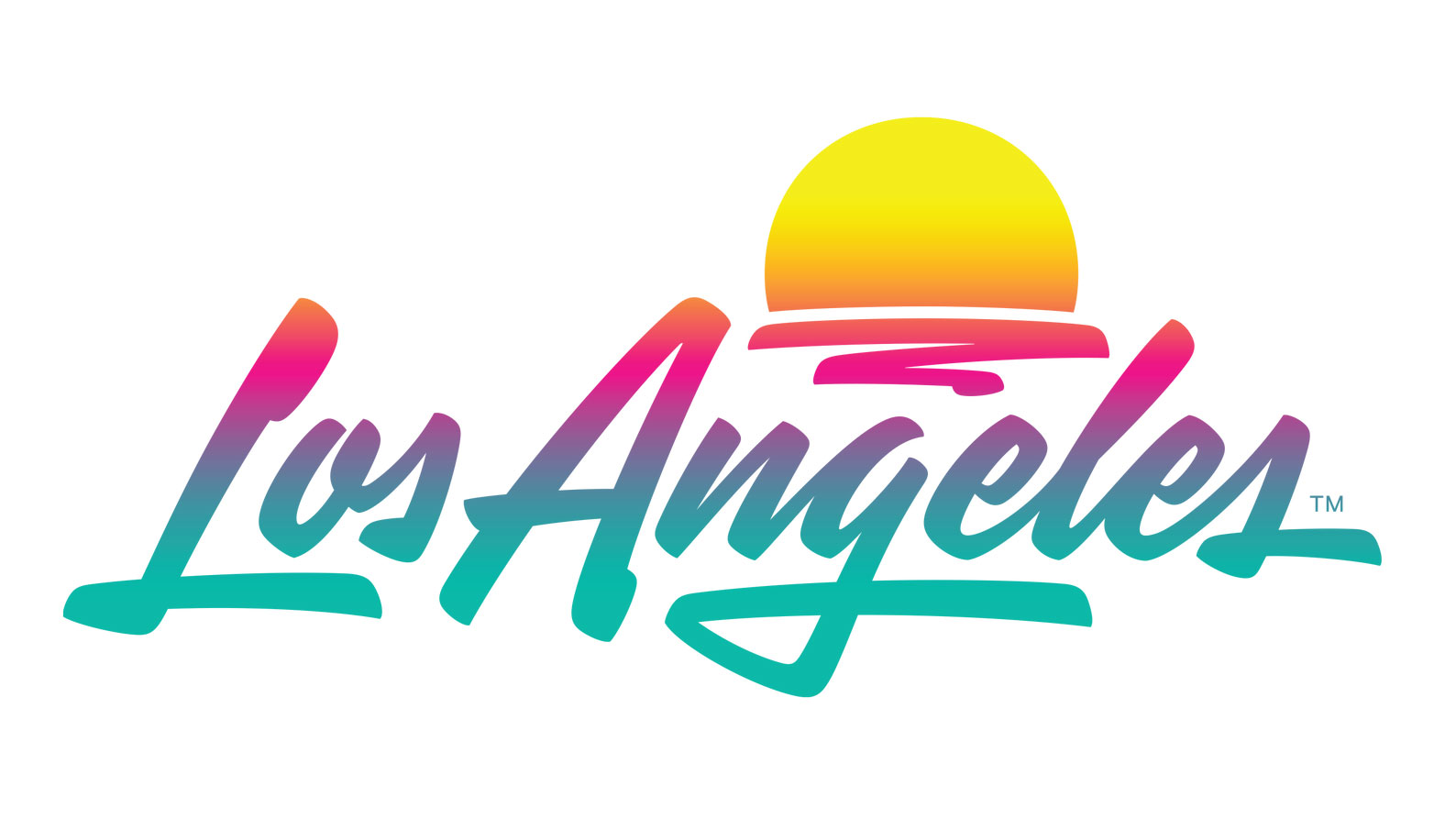
A sprawling urban city like Los Angeles with a population of 4 million and more people around the world with their own image on what Los Angeles is and what it represents, native Californian Shepherd Fairey’s goal was to leave this design open for interpretation and standout from other cities. But they have encapsulated the spirit of Los Angeles, that is rich in art and architecture with a blend of Spanish colonial, Mexican, and Mediterranean designs. Through the choice of cool and warm colours used in a gradient, they capture the street-cool-factor of LA, along with the nature and lifestyle of west coast beaches and sunsets.

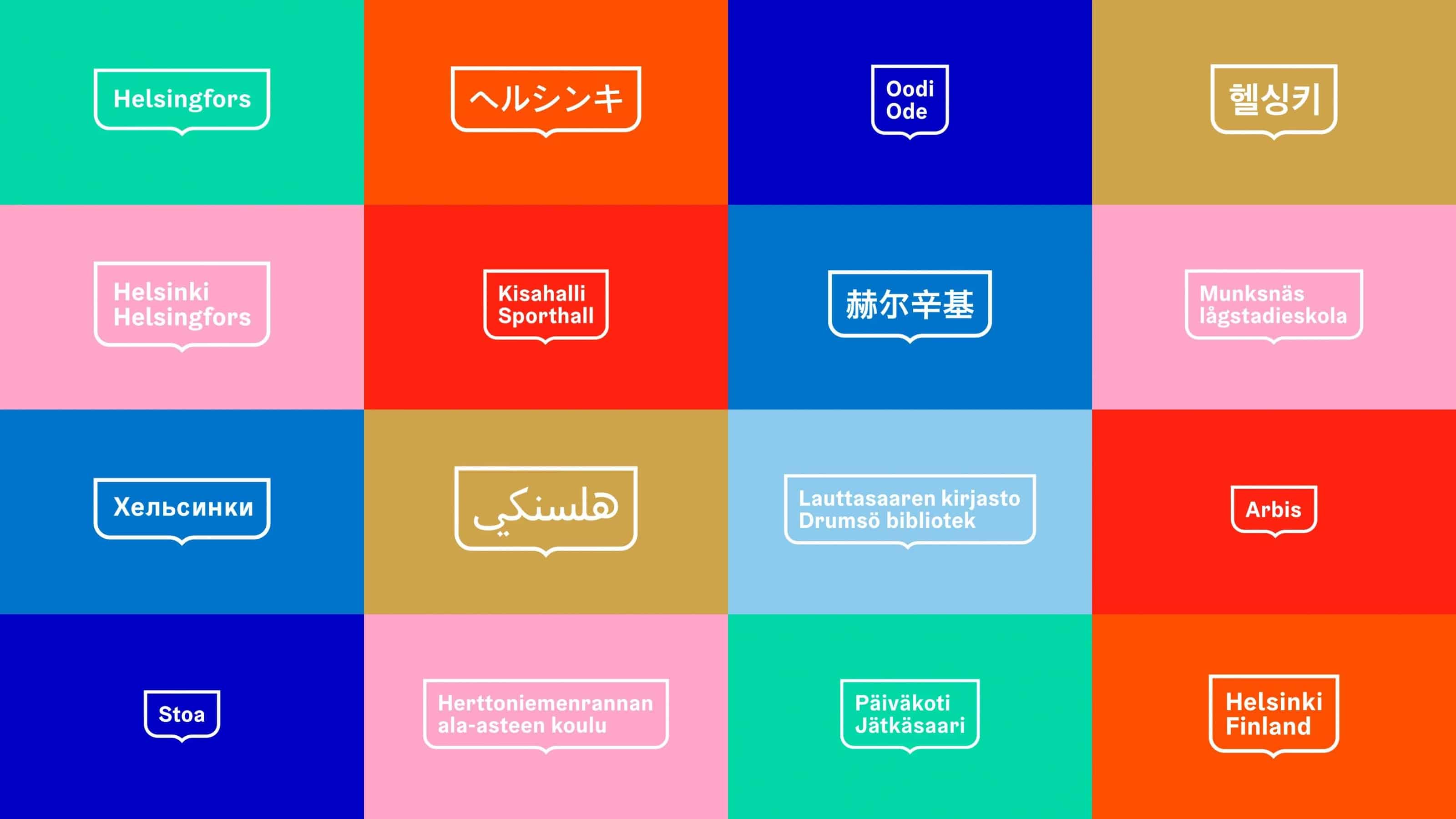
Another logo that was also tasked to a local design agency is Helsinki who took a more holistic approach of inclusiveness within their city and city organisations by keeping them involved in the decision-making processes. As a country with a bit more history and lineage to Los Angeles, the designers opted to pay homage to those lineages. The branding decisions behind this logo was to link back to one of the most recognisable symbols for people of Helsinki, the traditional coat of arms of the city. Recreating the coat of arms using the smooth lines and shape, makes this new logo responsive and adaptive to use across multiple mediums and widths, like different languages.
Bibliography
- Glickfeld, E. (2010). On Logophobia. On Logophobia, 69(3), 27.
- Helsinki Logo. (2015). Logo.
- Los Angeles Logo. (2021). Logo.
- Werklig Oy. (2019, April 4). City of Helsinki. Werklig - A Brand Design Agency from Helsinki.